We all know mobiles are here to stay and usage is skyrocketing – in fact 47% of emails are opened on a mobile device (Litmus) as a result we’ve had lots of customers ask us whether it’s best to design emails for mobile or desktop.
At PMZ Marketing we believe that it’s not something you should need to worry about. Ideally every email you create should look good on any size screen. So we’ve updated our email template editor to provide a really simple way for you to do exactly that.

You can now easily create responsive emails that are mobile friendly usingPMZ Vemail Marketing.
This means that your emails will look great on any screen size, whether it be desktop, tablet or a mobile device. So it’s a better reading experience for your subscribers across all devices.
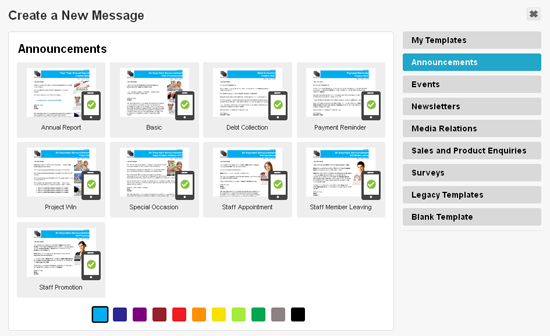
Simply look out for the mobile icon when creating a new email from selected templates.

The best thing is, you don’t need to do anything differently when editing your email templates as the responsive magic automatically takes place behind the scenes. Plus you can easily preview the email on different screen sizes before you send.
Well the following will all happen automatically, depending on the size of the screen your email is viewed on:
For now, the mobile friendly templates are only available for new templates that you create. But we’re working on a handy new tool that will allow you to convert your existing drag and drop emails to become responsive, so that you won’t need to recreate them.
Log into yourPMZ Vemail Marketing accountnow to try out your new responsive email templates.
08/12/2019
Planned Business Seminars and Workshops
24/09/2019